02 / RELEASE DESIGN — REZIN
SCREAM
PROJECT NOTES
Client Needs
The artwork needed to feel abrasive, unsettling and high-energy without relying on a clean or polished visual language.
Creative Process
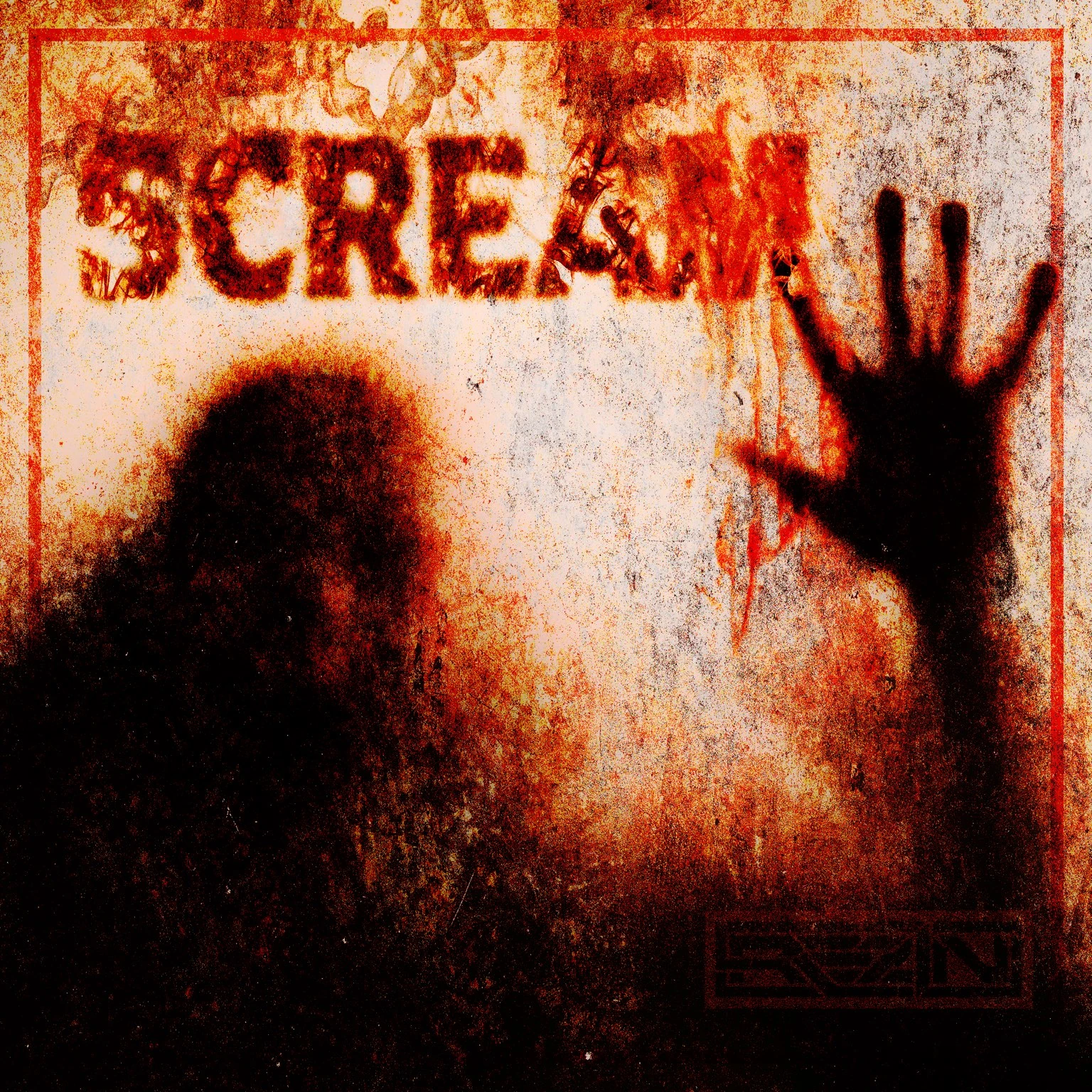
The concept uses silhouetted figures, a raised hand, aggressive red-orange grading and extreme distressed texture. Typography is partially obscured and degraded to make the title feel integrated into the scene rather than simply placed over it.
Final Delivery
A finished square cover designed for streaming and social use, retaining a strong silhouette and title read even when viewed at reduced size.