DIAL
Client Needs
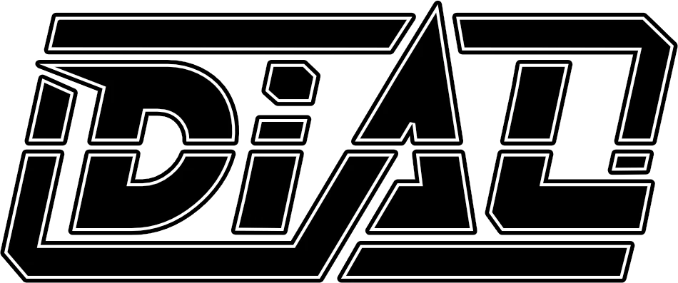
DIAL required a logo that could function as a standalone artist mark: immediately readable at small sizes, distinctive enough to anchor artwork, and flexible enough to sit comfortably across social profiles, event graphics and future visual campaigns.
Creative Process
The direction focused on turning the name itself into the identity. Angular cuts, extended framing elements and a central geometric emphasis were used to give the lettering a technical, engineered character. The outline treatment keeps the structure clear while allowing the mark to sit naturally over dark or image-led backgrounds.
Final Delivery
The final DIAL identity delivers a compact horizontal wordmark with a strong silhouette and enough visual character to work independently as the core of the artist’s wider branding system.