KRUZA
Client Needs
The identity needed to give KRUZA a strong, instantly recognisable presence across the places listeners encounter the artist most often. The system had to work at small social-profile sizes while also having enough visual impact to expand into banners, promotional graphics and larger digital applications.
Creative Process
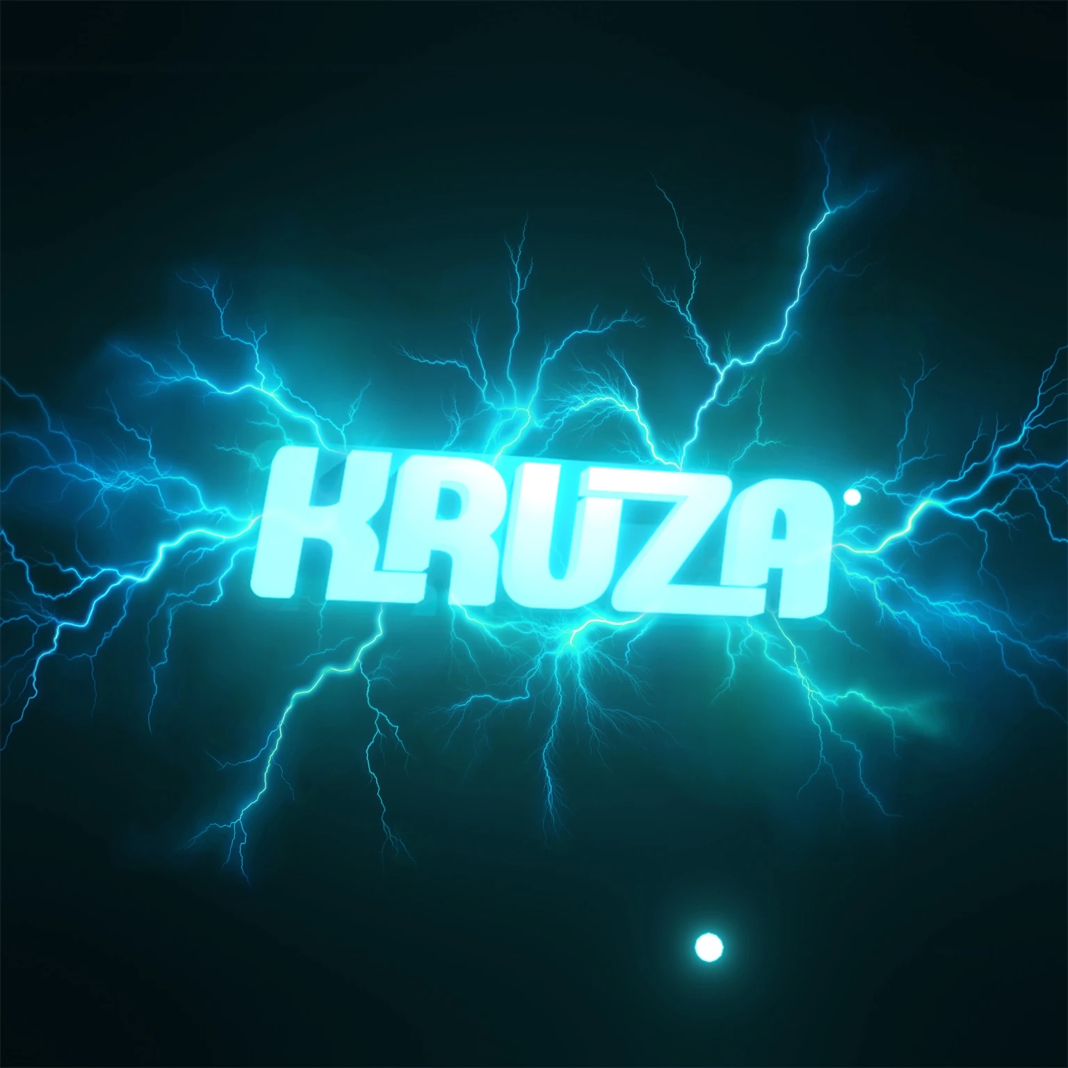
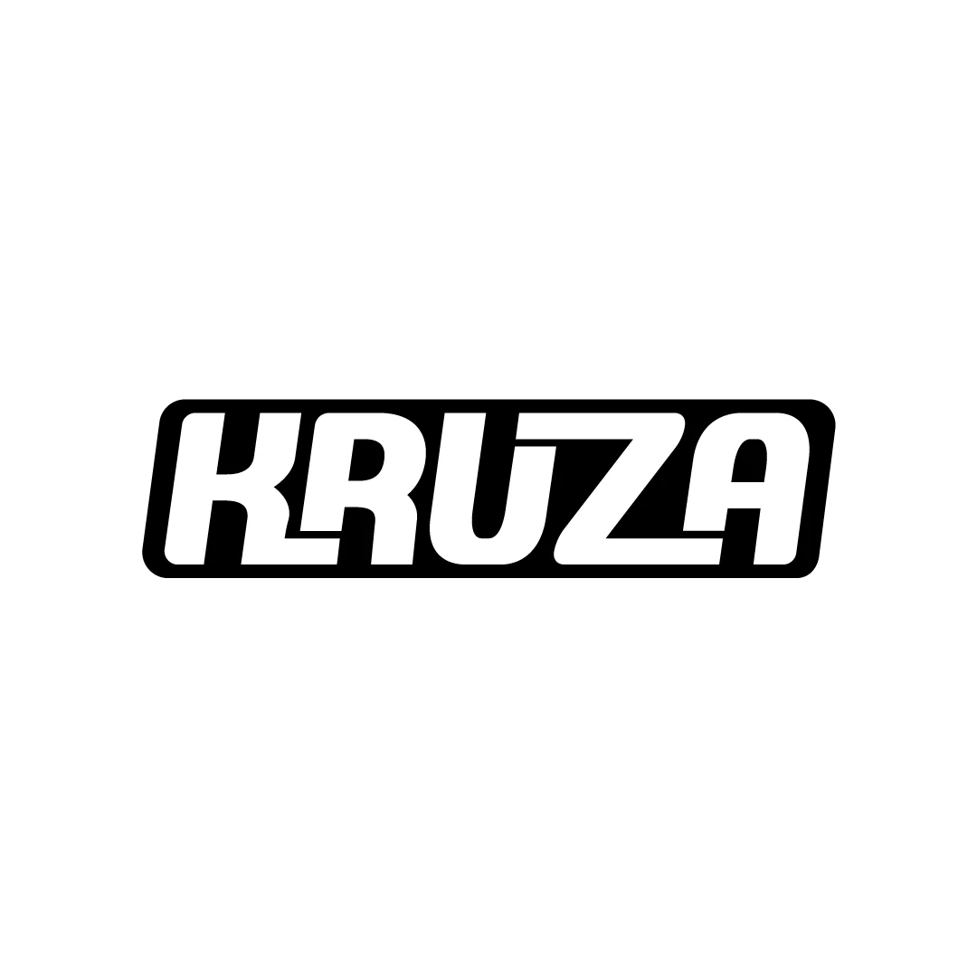
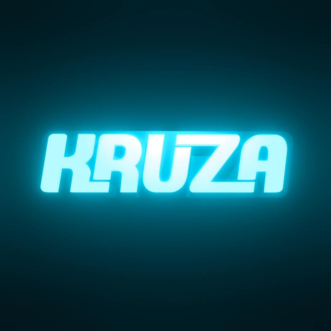
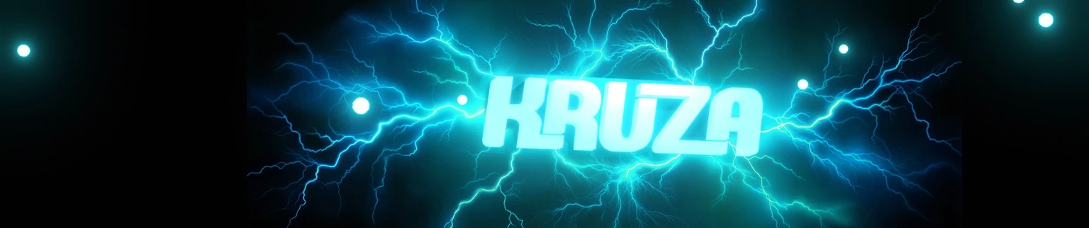
The project began with the wordmark as the core asset: a wide, forward-moving letterform with sharp geometry and a compact silhouette. From there, the identity was developed into a dimensional treatment using cyan light, depth and glow. Electric-blue lightning became the supporting visual language, reinforcing the energy of the name without competing with the logo itself.
Final Delivery
The final identity includes the primary KRUZA wordmark, a 3D illuminated logo treatment, social-profile artwork and a wide SoundCloud banner. Each asset uses the same typography, cyan palette and electrical visual language so the artist remains visually consistent across different formats and platforms.